The museum had a touchscreen about the history of American currency that had been on the gallery floor for about a decade. It still worked, but it was built for a horizontal monitor, its content had fallen behind the collection, and accessibility expectations for public kiosks had moved a long way in ten years. The museum was moving into a new building with large vertical displays, and it wanted the interactive refreshed in both content and function to go with it. The question was never whether to redesign it. It was how much of the original to keep.
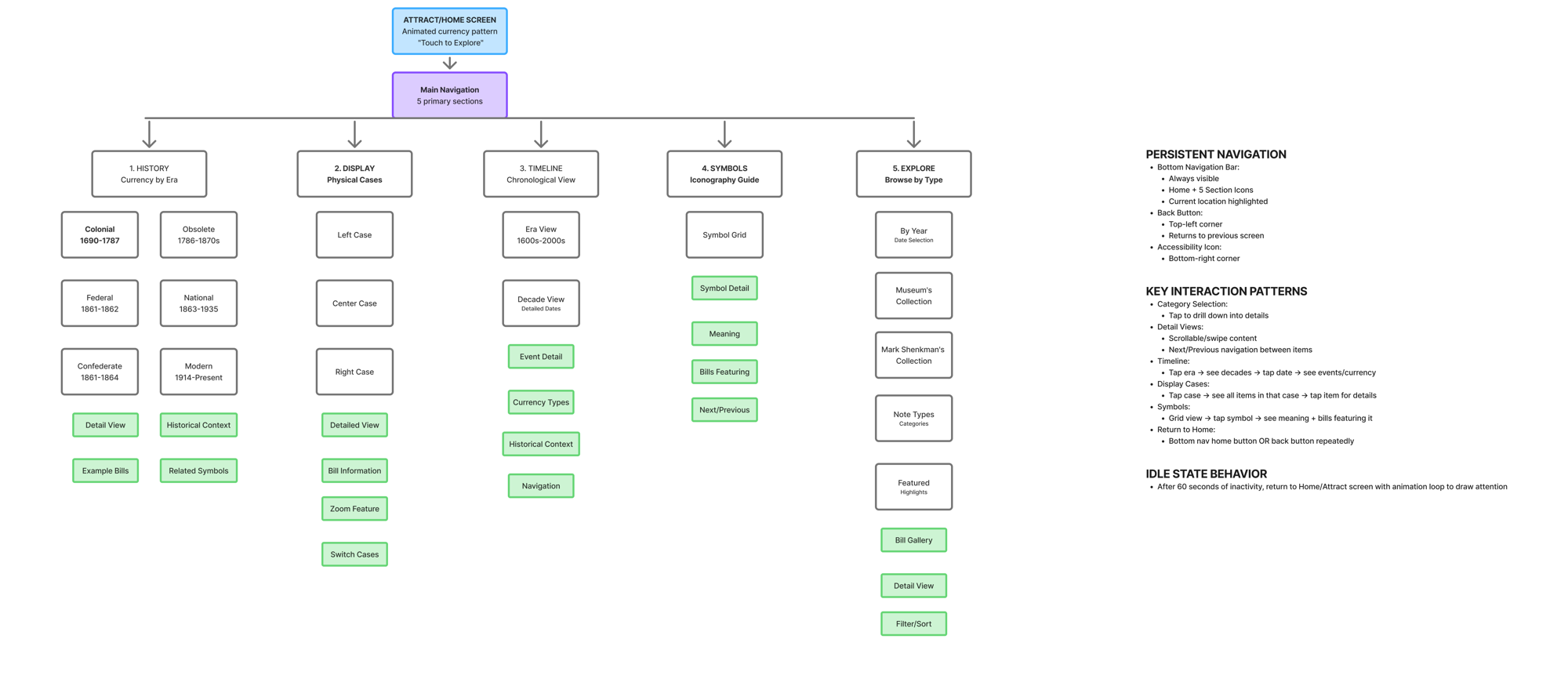
The museum's content team defined the five sections visitors could explore: the collection by era, by the physical display cases in the gallery, by timeline, by the symbols printed on the notes, and a browse-by-type section for anyone who wanted to go deeper. My job was to turn those five into one coherent kiosk, on a format the original had never been designed for.
I worked out the whole flow before drawing a screen: every section, every level beneath it, and the three behaviors that have to hold on every screen of a public kiosk. A bottom navigation bar that never disappears, so a visitor is always one tap from any section. A back control in the same place every time. And an idle state that returns to the attract loop after sixty seconds, so the kiosk is never left mid-task for the next person to untangle.
The programmer reviewed the flow before anything was wireframed, so every branch on it was something the build could actually do. On a seven-month project with one developer, that one review saved weeks.
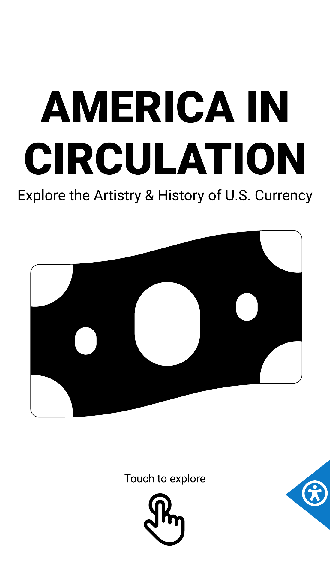
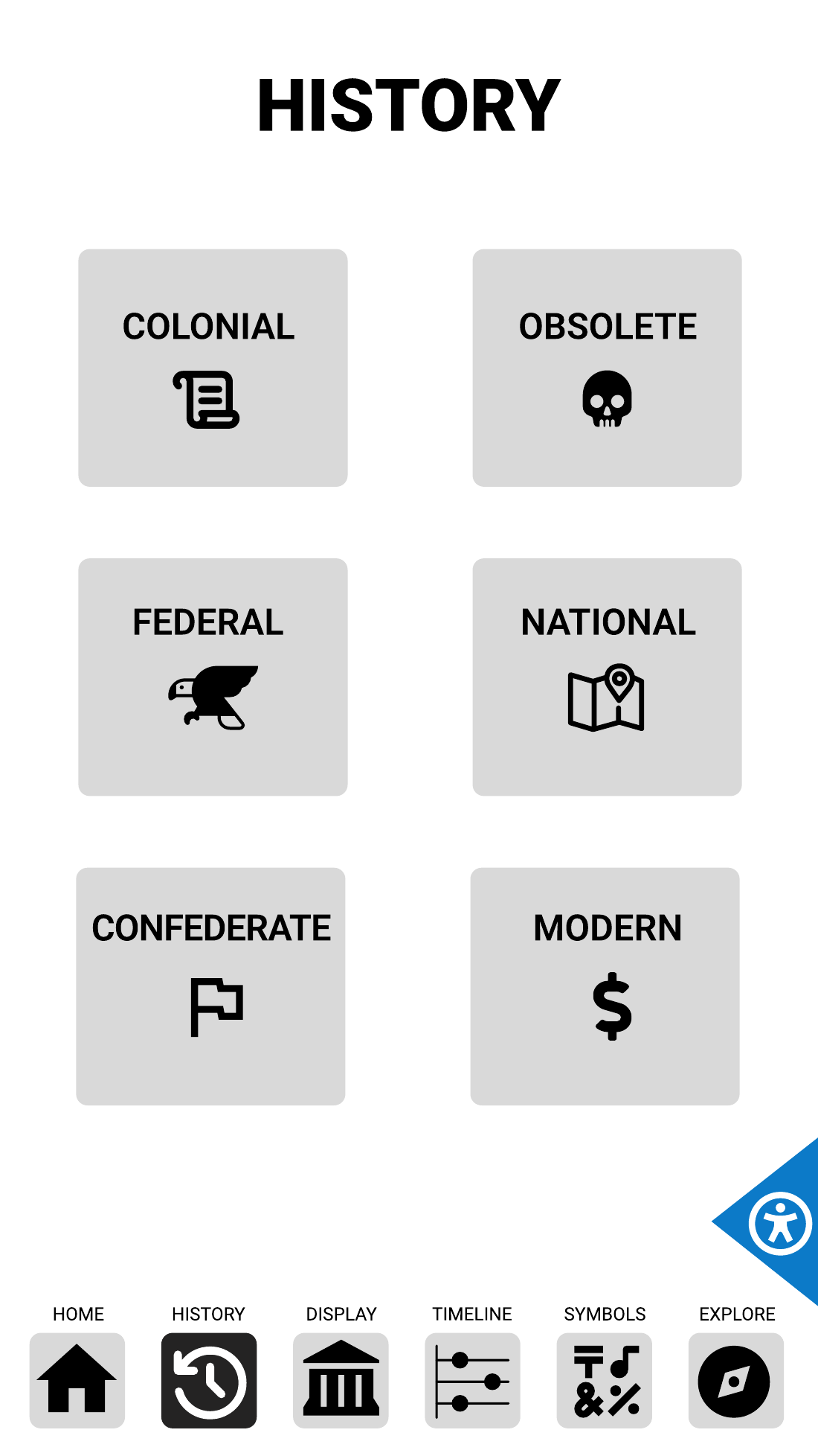
The wireframes have no color on purpose. The museum had a print exhibit with its own palette, type, and engraving imagery, and the interactive would adopt all of it later. So every review before that point needed to be about structure and not about taste. Gray boxes keep a content team talking about what goes where instead of whether they like the blue.
A few of the decisions the wireframes settled:
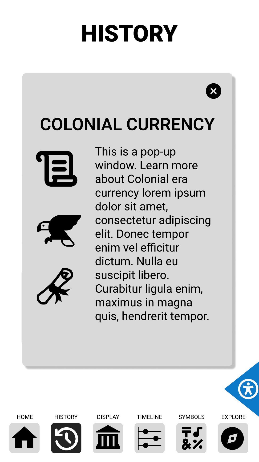
Panels, not pages. Era details open as a panel over the History grid rather than as a new screen, so a visitor comparing two eras taps back and forth without losing the grid.
One timeline, two depths. The timeline opens as a single scrollable line of decades, then expands into cards with an event per decade and a tap-to-reveal description. Nobody reads a wall of dates on a gallery floor. They skim for a decade they care about and open one thing.
Symbols as a grid. Twelve symbols, twelve equal tiles, one tap to a meaning and the bill it appears on, with previous and next so a visitor can walk the whole set without returning to the grid every time.
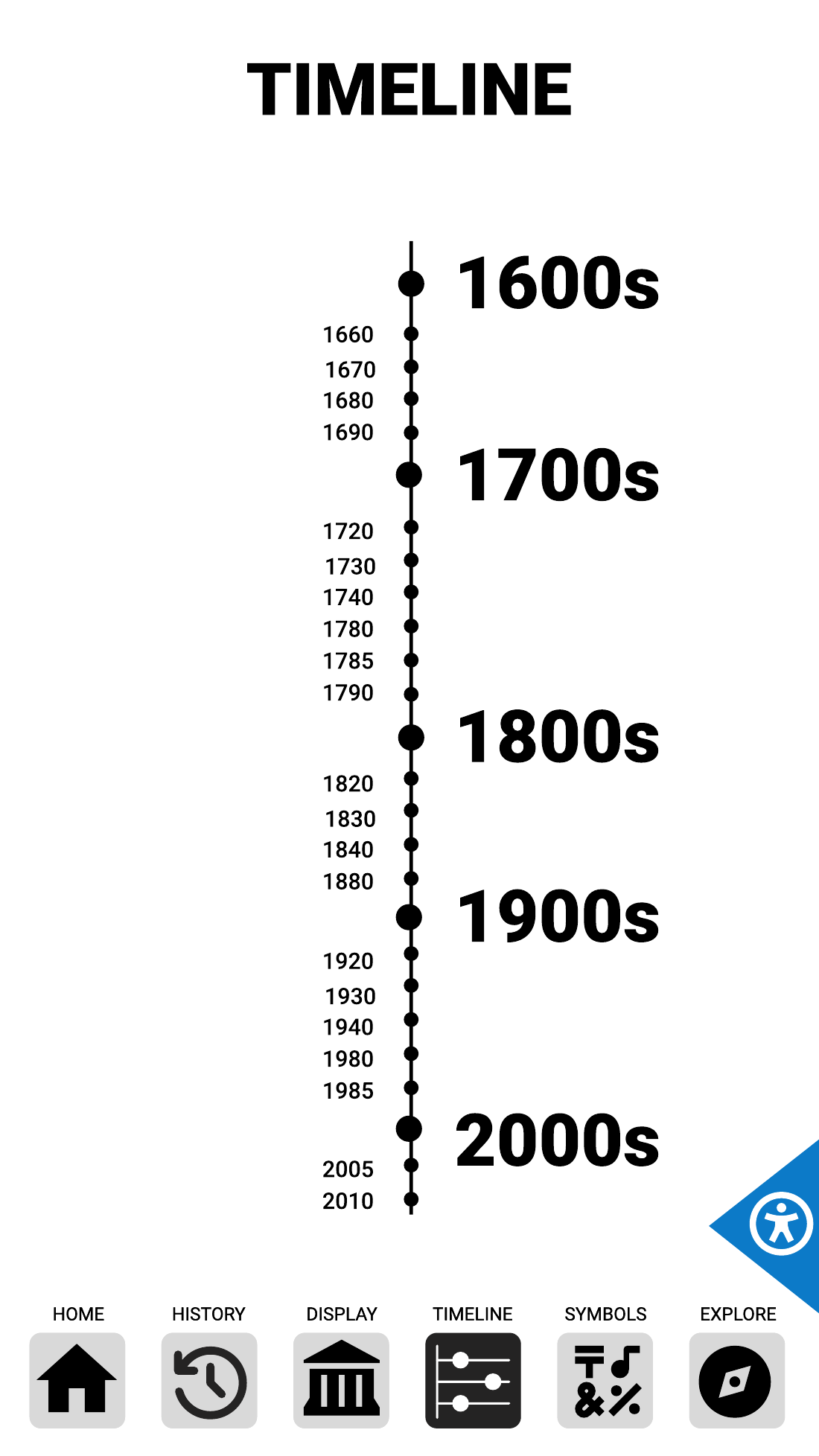
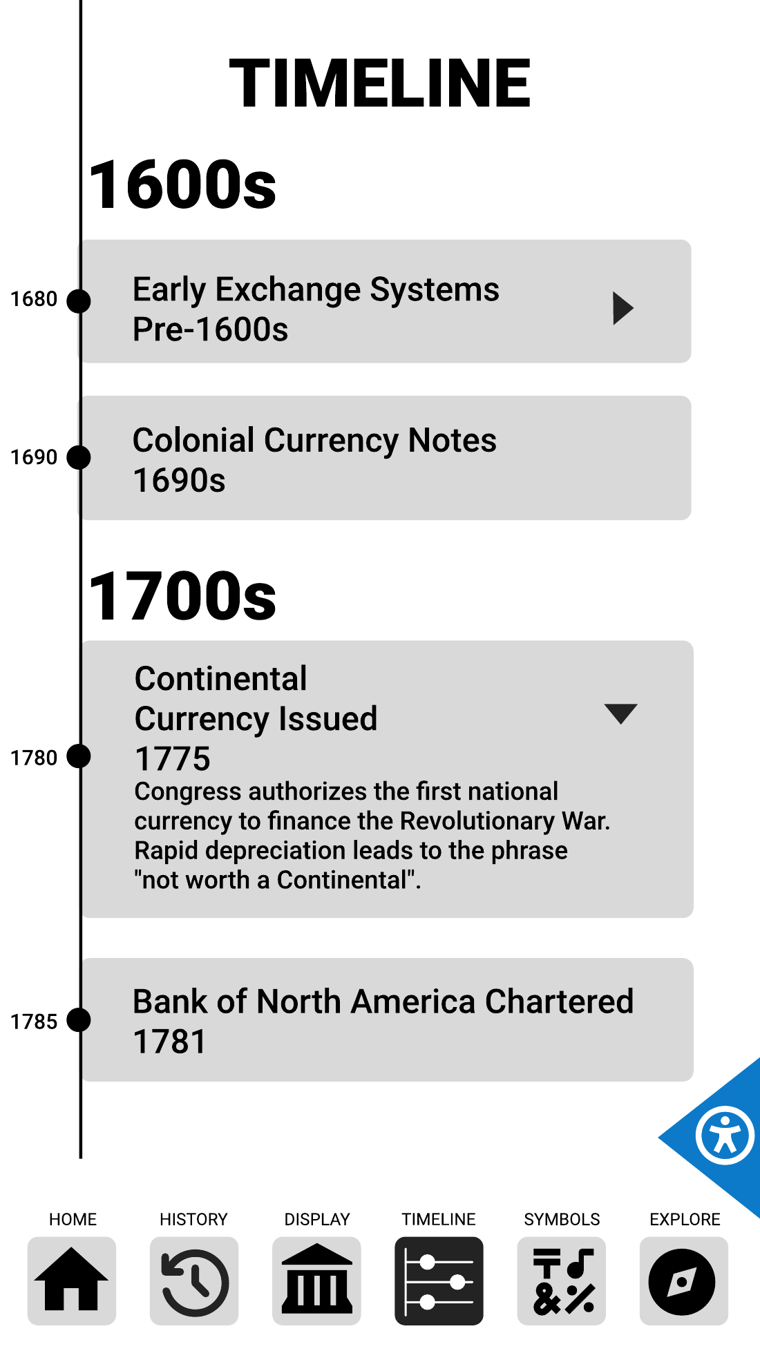
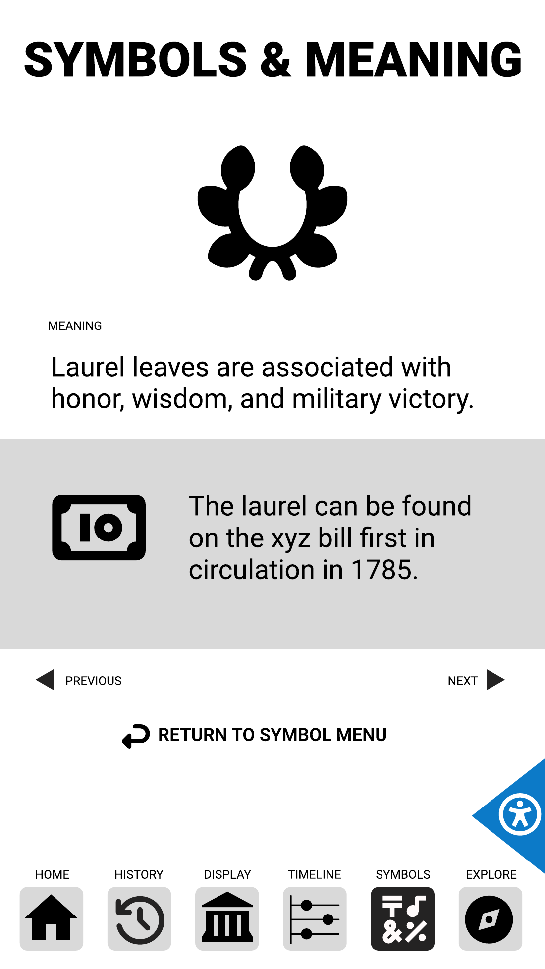
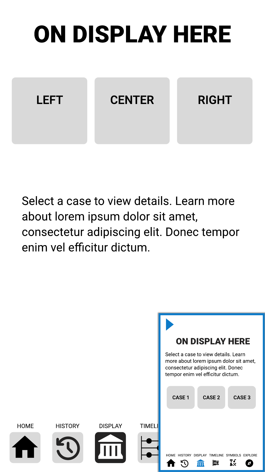
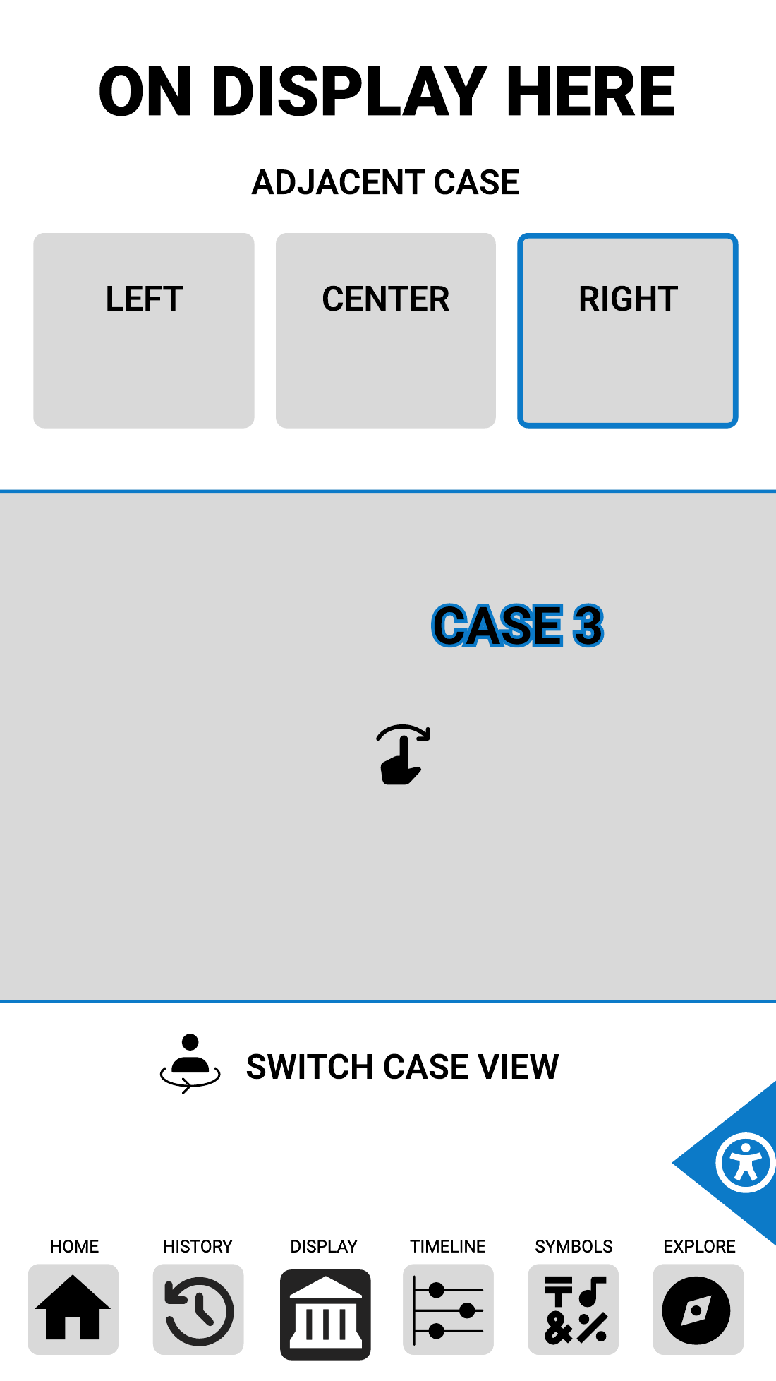
The new displays are mounted vertically and stand taller than most of the people using them. That changes the ergonomics completely. The top third of the screen is above a comfortable reach for many adults and well out of reach for a child or a seated visitor. So the layout puts every control in the lower two-thirds: navigation along the bottom edge, content in the middle, and only titles and imagery up top. Touch targets are sized for a fingertip at arm's length, not a cursor.
The blue corner in the bottom right is the accessibility control. It serves two needs at once. For visitors who use a screen reader, it switches the interactive into a readable mode. For visitors in a wheelchair, it opens a compact version of the current screen in the lower corner, within reach, with the same content and the same navigation. The Display section is the one most tied to where a visitor is standing, so it was the first screen I worked through at the small size.
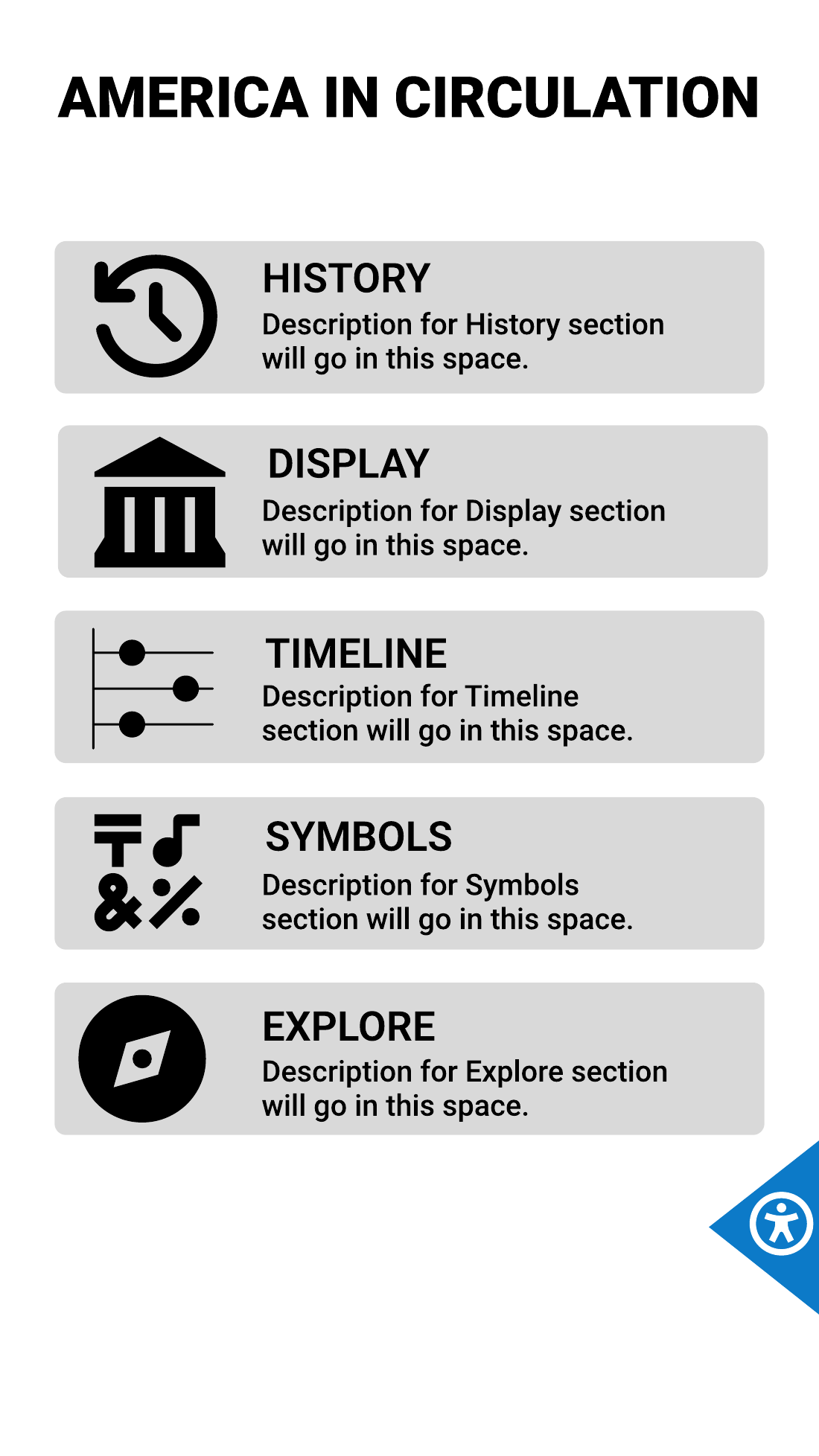
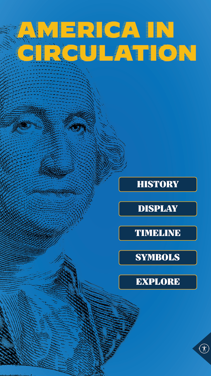
Once the structure was approved, the print exhibit's palette, typography, and engraved portraits went on. The two home screens below are structurally the same screen. The gray one is what the content team and the programmer agreed to; the blue one is what visitors see. That the second could follow the first without reopening a single navigation decision is the whole argument for doing it in this order.
The interactive went live in July as part of the museum's public reopening in its new building, on the gallery floor for opening night. The flowchart and wireframe set stayed the shared reference for the content team and the programmer all the way through build, which on a project with a half-year runway and a contracted design role is what keeps everyone pointed the same direction.
Wireframes shown as delivered, with placeholder content. The finished screen is a design comp, before final content was placed. The finished interactive is shown in full under Design work.